ICSSI
back to all projectsProblem
The International Conference on the Science of Science and Innovation brings together researchers studying how science itself works — how discoveries happen, how innovation spreads, how ideas connect across disciplines. The existing logo didn't reflect any of that. It looked generic and dated, and for a conference whose entire subject is the structure of knowledge and connection, a visual identity that felt flat and forgettable was a missed opportunity. The founder came looking for something that could represent the conference's ambition and hold up across every surface it would touch — website, email, signage, slides, and apparel.
Decision
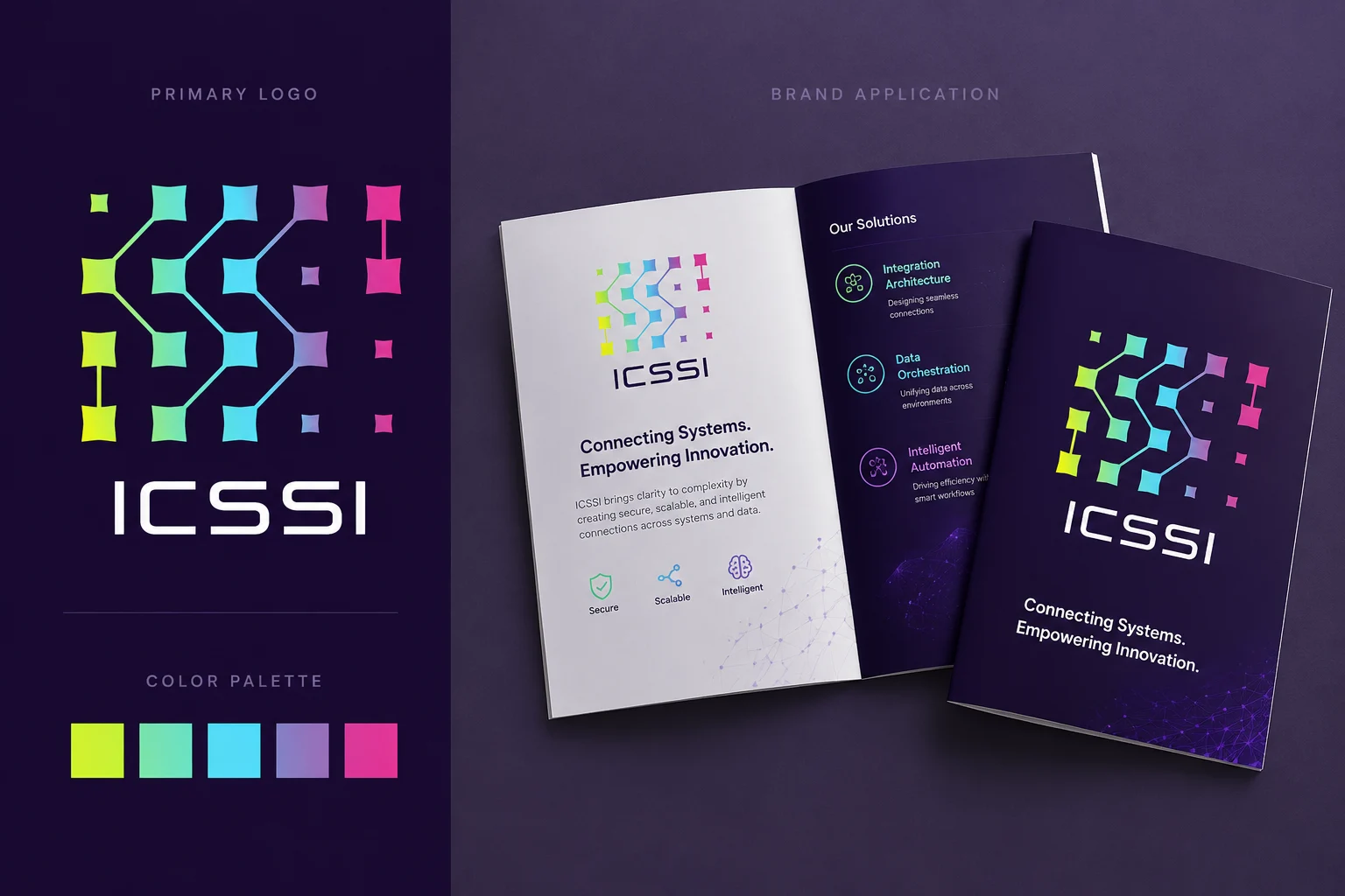
The concept is built around a network of nodes — rotated diamond shapes connected by lines that map the kind of cross-disciplinary relationships the conference studies. What reads at first as an abstract data visualization is also, on closer inspection, a hidden message: the connecting lines spell out ICSSI. The color palette moves deliberately from yellow-green through cyan to magenta against a deep indigo background — bright and engaging enough to stand out in a crowded inbox or conference program, but grounded enough to carry real visual weight. The darkness of the background gives the gradient nodes a luminous, almost astral quality that lifts it well above typical academic conference branding.
Outcome
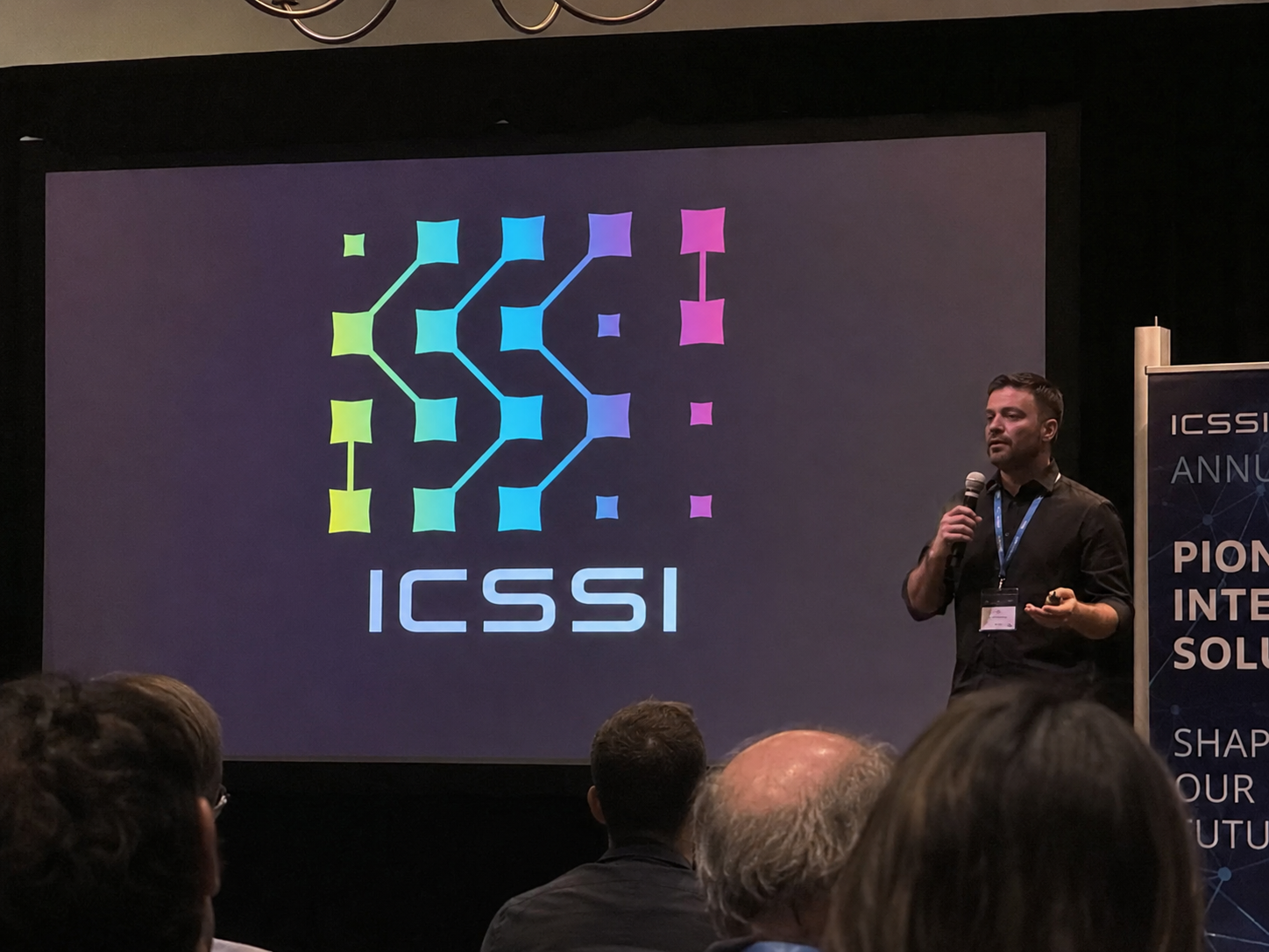
The logo now appears across every touchpoint of the conference — advertising, emails, the website, presentation slides, and conference shirts — functioning as a coherent identity rather than just a mark. For an annual international conference, consistency across that range of surfaces matters, and the design holds up at every scale.