Midway Classic
back to all projectsProblem
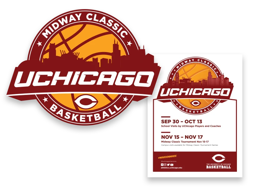
The Midway Classic is an annual NCAA Division III basketball tournament hosted by UChicago — a legitimate athletic event that deserved a mark to match. The existing logo was eleven years old, and the problems were practical as much as aesthetic: players and fans didn't want to wear it. The colors felt off, the design felt dated, and nothing about it said tournament-worthy. A logo that people actively avoid putting on their body isn't doing its job.
Decision
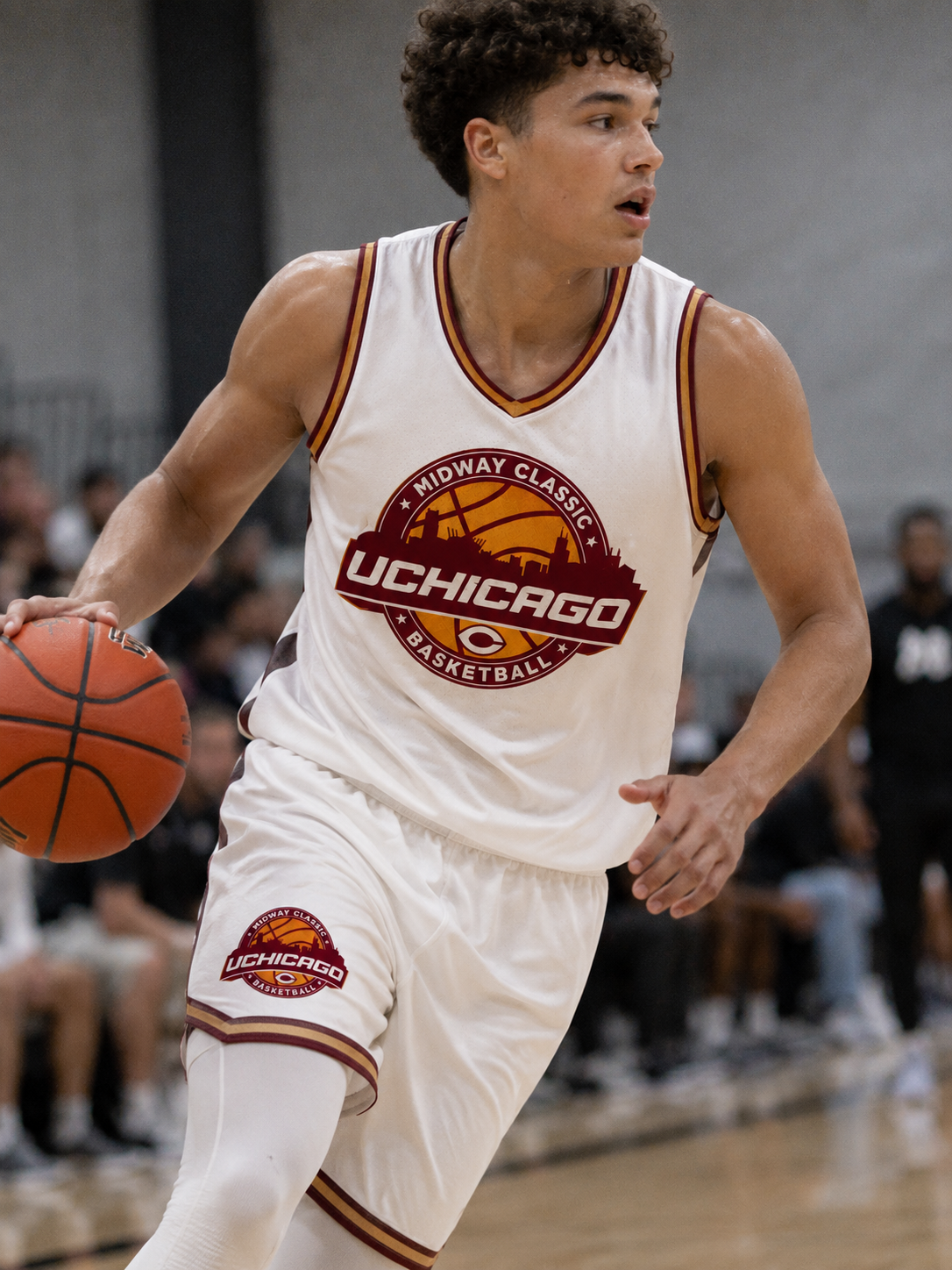
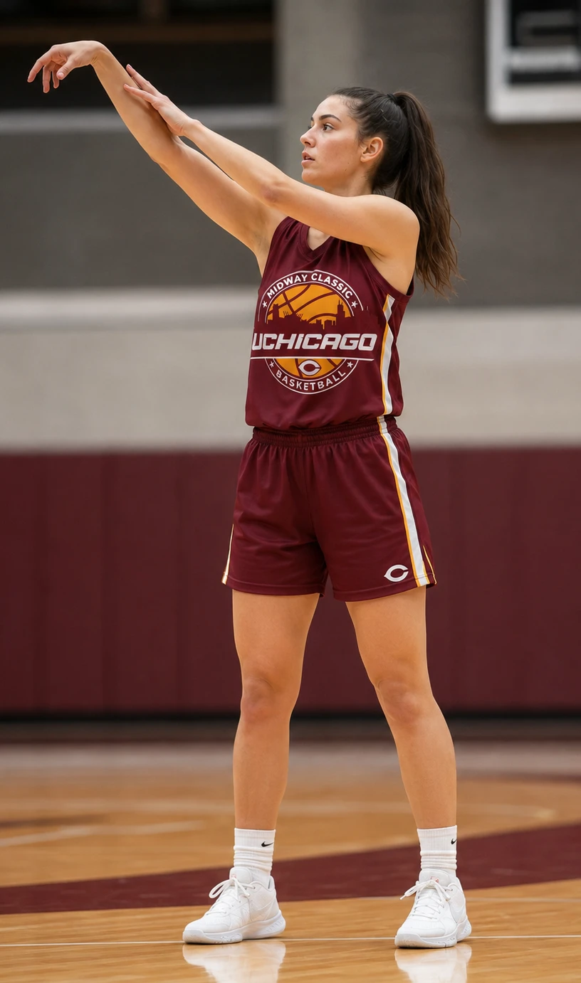
The redesign needed to accomplish two things simultaneously: communicate UChicago's identity and situate the tournament in Chicago itself. The solution layers both skylines inside a single basketball — UChicago's distinctive gothic spires and Cobb Gate arch silhouetted in the foreground, the Chicago city skyline rising behind it, all set against tournament gold. A bold maroon ribbon cuts across the center with the 'UCHICAGO' wordmark in white, anchored by the Maroons 'C' mark below. The circular badge format, star details, and arched typesetting give it the visual language of a serious athletic event — something that reads equally well on a jersey, a pair of shorts, a poster, or tournament signage.
Outcome
The logo is now on apparel that people actually want to wear — which was the baseline measure of success from the start. It appears across jerseys, shorts, posters, and event signage, giving the tournament a cohesive visual identity that holds up at every scale. For a university not primarily known for its athletics, a mark this confident sends a quiet but meaningful signal.